Hi there Friends!
Marta's here today with her brand new art journal creation and as always she made some truly stunning art...
Marta's so amazing at using very subtle means to achieve a spectacular effect!
We hope you'll feel inspired!
Marta's here today with her brand new art journal creation and as always she made some truly stunning art...
Marta's so amazing at using very subtle means to achieve a spectacular effect!
We hope you'll feel inspired!
* * * *
Hello there!
It's Marta here today - and I have for
you my new vintage journal spread.
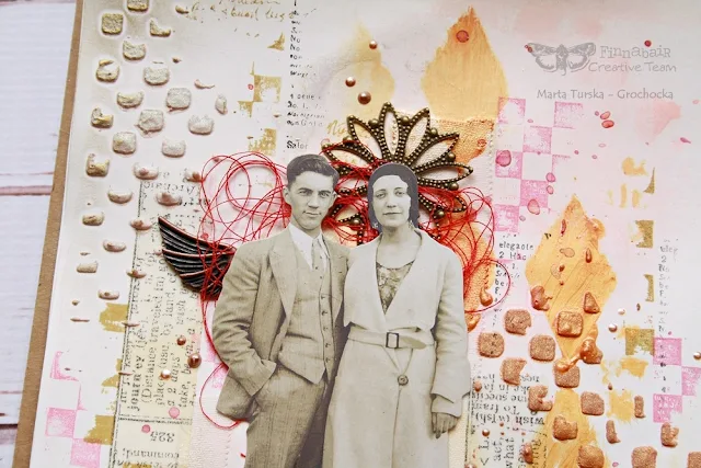
I was inspired by a picture of this lovely couple and fell in love with their clothes, posture and the feeling of being really close.
In the background I used pieces of tissue tape as well as some adhesive cotton plasters - the ones you can easily find in ever pharmacy. :)
I really likes the texture they created and wanted them to be visible, that's why this time I used Clear Gesso. It works just like the white one and is just as good, but it really helps to accent elements in the background. I applied it with a silicone brush, it gives a smooth and clean surface.
Next step was mixing Texture Powder with Ginger Magic Acrylic Paint. I don't know if you've ever tried this, but you definitely should! The mixture (when it's dry) has a cool rough surface and an amazing sparkle, it's perfect for using with stencils or as a texture paste. Just love it!
Later I've mixed Opal Magic Aqua-Rose Acrylic Paint with the Texture Powder in the same way.
This time the mixture was smoother, but it has a cool two tone shine.
I've used the same paint in the background - first, I used some water and I applied paint in a few places with a brush and with my fingers.
After I've dried paint with a heating tool, I
used Fresh Orange Metallique Acrylic Paint with a Harlequin stencil.
Then I used some pink color sprays to add color in the background.
In the end I added some stamps - the Butterfly plus ' Messy' and 'Read To Me' clear stamps.
I love to add only accents of stamps to make my background more interesting and not too neat or precise. I just love this kind of artful mess. ;)
I completed my pages with some red thread, metal embellishments, Vintage Gold Wax and liquid pearls.
As you can see I used Checker stamp and stencil - they perfectly complement each other.
I think this pattern is very stylish and really universal, I often use it for my backgrounds multiplying it and using different kinds of supplies and mediums.
Here's the video with my creative process step by step. Enjoy!
Using
orange and red meant for me leaving my comfort zone - these are the colors
that I always tend to avoid.
But this time I must say that I'm really satisfied with the effect, I like mixing these colors with pink and gold.
I think they go really well with the photo :)
And what do you think?
But this time I must say that I'm really satisfied with the effect, I like mixing these colors with pink and gold.
I think they go really well with the photo :)
And what do you think?
xx
Products used:


3 comments:
Awesome!
Beautiful pages!
Fabulous! Thanks for sharing.
Post a Comment