Monday 29 May 2017

John's Artist's Journal

Hi there Friends!
As I was reading John's project, I simply couldn't stop smiling.Not only did he create the most beautiful art journals explaining how and why, but also used my favorite colors and some really fond memories of us two making art together last April... Enjoy!

Also: Don't miss my beautiful Ambassadors' new post about Simplicity! They did such an amazing job (again!) putting together their thoughts, ideas and inspiring projects.

*   *   *   *
I began my artist journey many years ago creating journals for myself simply because I couldn't find the 'perfect' journal to use. The journals that I found in stores were either to small, didn't fit my style, or didn't have the right paper inside for being creative. So I started creating my own journals that fit my personality and mood at the time.

For some reason along the way, I stopped journaling – I don't know if it was for any one particular reason, I just got out of the habit. I used to journal daily, I took my journal with me everywhere I went and was constantly jotting down new ideas or sketching out my next project.
My journals turned into a hodge podge of pseudo scrapbook/sketchbook/catch all for things that I found along my adventures and journeys. I could write pages in one sitting, my journal was my space to sort things out, give myself encouragement, and to dream.

Fast forward to the beginning of April when I had the pleasure of Anna staying with me while she was in between teaching. Not only is Anna the perfect house guest, but she also makes the best Polish stew in the world!
When she first arrived, I told her that she was more than welcome to use my studio space anytime she wanted. One evening I was wondering where Anna was and I ventured back to my studio to find her pleasantly working away on her travel journal and I joined her working on another project.
At the time I didn't realize that this was the journal that she's featured in recent posts using the new Impasto Paints (duh!) but while hanging out working on our own projects, I realized how much I missed journaling and having that freedom of exploring without having to worry about judgements and following rules.
It was at that moment that I decided to create my own journal and try to get back into the habit of journaling!
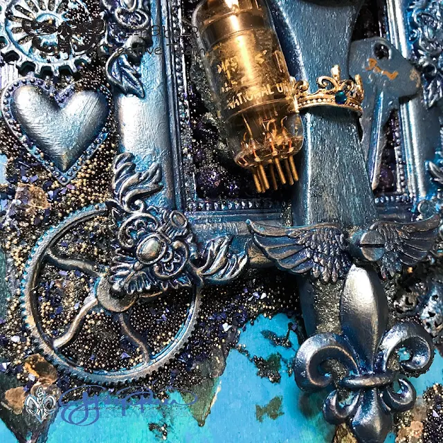
And I'm going to share with you how I created my own Artist's Journal using some of the new releases including Impasto Paints, the new colors of Metalliques and the Mega Art Stones. Because this is going to be my personal journal, I wanted to make something that I absolutely LOVE and decided that I would use my favorite colors for this project, blue and silver.
I started creating the cover of my book with a nice, thick layer of Jade Impasto Paint.
If you haven't used these new paints, they're absolutely AMAZING! These paints are opaque which means that you can layer them, and if you want to have the consistency more thin you can add a little water or even Soft Gel.
For this project I put them on thick so I could build some layers using both a brush and a palette knife. Next I layered Azure Impasto Paint over the Jade.
To create the background pattern, I used the Harlequin patterned stencil.
I couldn't resist using the new Dark Forest Metallique paint so I dry brushed this through the stencil for the base color of my stencil work.
With a palette knife, I added Cobalt Impasto paint to add both color and some rich texture.
Once dry, I highlighted the texture from the Cobalt Impasto paint with Pearl White Metallique, followed with Mermaid Teal Metallique paint.
To finish the color, I brushed a light layer of Midnight Sky Metallique paint to give a blue tone to the stenciled work.
Now it's time to start coloring the embellishments!
I wanted to see just how opaque the new Impasto paints are so instead of using Heavy Gesso as my base for my embellishments, I instead chose Azure Impasto paint – and the results were exactly what I was looking for even on the metal embellishments!
I used Midnight Sky Metallique for the next color followed by Deep Waters Metallique.
To finish coloring the embellishments, I used my fingers to apply Brushed Iron Metallique Wax followed with a touch of Summer Sky Mica Powder.
To adhere all of my embellishments to the book cover, I mixed together Graphite Texture Paste with a touch of Deep Waters Metallique to give a slightly blue hue to the texture paste.
After placing my embellishments into place, I sprinkled the wet Graphite Paste with Frosted Mica Flakes, Midnight Blue Glass Glitter, then Black and Silver Micro Beads.
I’ve been waiting to use the new Mega Art Stones and decided that they would make a great background underneath the decorated paint brush inside of the frame.
I used Graphite Texture Paste as the adhesive, then added the stones and heat set. I then colored the stones with Midnight Sky Metallique paint, applied on the thick side with a brush.
While the paint was still wet, I sprinkled the painted stones with Splash and Black Micro Beads to add more color and dimension and then heat set.


I can’t wait to start writing inside of my journal – especially with all of the new product inspiration on the covers!

And all of us can’t wait for you to share with us what you’ll create with the new Finnabair products. :)

xx
Products used:

Friday 26 May 2017

Ambassadors' Meeting - Simplicity

Hi there Friends!
I hope you didn't miss the big news about my products hitting the shelves in Michaels stores in USA and Canada! It's such an amazing feeling and I'm really thrilled to be finally sharing this news with you - I hope more of you will have the possibility to reach for my products - all made with so much love! ;)
Getting ready for the Michaels launch, we talked a lot about simplicity - creating artworks that are not intimidating, with ideas and instructions that are easy to follow and encouraging for beginners and inspiring for people who already know mixed media well.

It really got me thinking and I asked my super talented Brand Ambassadors to join in the fun. :)

This month we are discussing Simplicity.

Each of the Artists will confess if it's their style or maybe they express themselves more freely when things go 'complicated'. ;)
My Ambassadors are sharing their thoughts AND each of them presents a beautiful piece they created that best illustrates the theme WITH some really cool tips and tricks. You'll love this post to bits! :)

*   *   *   *

Whenever I want to keep it simple on my spread (which is more often than not), I like to start with some Modeling Paste. Either over a stencil or spread on the paper to then stamp in.
Depending on the stencil, the stamp, the colors, the embellishments you add, you can go from something very soft to something very dramatic in no time. Yet the spread still looks simple!

For this first spread, I added Modeling Paste over Finn's Checker stencil.
I added some shades of grey and ochre and my background was ready!
It has a softness to it that allows the embellies to speak for themselves.

The second spread was a bit more intricate. You can watch the whole process here.
Let's just say it all started with some Modeling Paste and one of my stamps :)
 
Texture is, to me, the most intimate way to express myself in my art journal, because of, among others, the diversity in effect it offers. So I guess modeling paste is one of my best friends!
How about you? Who's your mixed media best friend? :)


I do not create "simple" projects well, but I really admire those people who make them look so stunning.
I always seem to go just a bit too far... but since I continue to add and remove pieces from my projects BEFORE I glue, I can pull back a bit before the final stage.
 
For this simple wall hanging I used 2 plain pieces I found at Michael's, a metal plaque and a resin medallion.
Rust Paste is used directly onto the metal plaque.
The Patina Pastes are added to the resin piece.
A bit of Patina is also added to the tin piece.
Sprinkle in a few Metallic Micro Beads and Mica Flakes and glue into place with Soft Gloss Gel.
The wonderful Heavy Body Gel sets the medallion in place with a thin wooden circle underneath to raise it from the plaque. Done!
Tip: I use a fine tip applicator to put down the Soft Gloss Gel before added my bead and flakes.


For those who know me and my creativity, you will know that:
Simplicity! It makes my heart sing!
Simplicity! It's my thing!
Simplicity! It's my Creative Vibe!

Even with the full wonderful range of Finnabair mixed media products at my disposal I still have a simple/minimalist approach to the design and creation of my projects.
So with that in mind I would love to share with you some recent creativity that I have been sharing on my Instagram account for #the100dayproject.

Black + White + Doodling = Simply Divine.
I have used two of my favourite Finnabair products from the Art Basics range: Black and White Heavy Gesso.
To create these projects I have used either a canvas board or a canvas, however they can also be created in your journal.
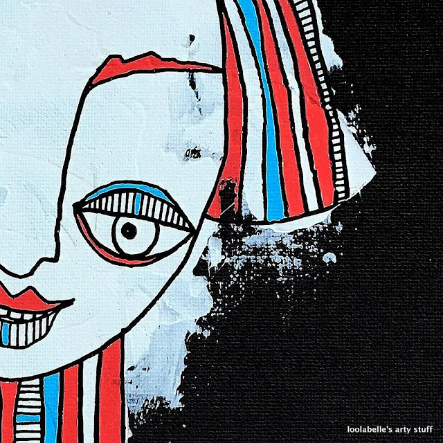
I painted the canvas board/canvas first with Black Gesso. Then using a medium sized palette knife, I applied the Heavy White Gesso to the background to create a background head and shoulders profile shape.
Then to complete these funky portraits I used my paint markers to draw and doodle a 'Funky Peep', over the white gesso area.
So what is not to love about Finnabair's Heavy Gesso? I love it and I so loved using it to create my Funky Peeps! Simply Divine!

Me and simplicity are good friends when we meet occasionally. That is to say if I just happen to make a project that's simple.
When it turns simple naturally, then it's good. When I TRY to do something simple... well, that doesn't end well. The project gets annoyed with me and me with the project.
I feel most at home with projects that are not simple. Or they are to me, but I guess they look complicated to others.
I love when creating is simple, just going with the flow, but the end result rarely then is looking simple.

For this Cafe I created a couple of cards that were supposed to be simple. I think I managed quite well! They look fun and are super easy to make.

I mixed some Glitter to 3D Gloss Gel and used this self-made glitter paste through a Star stencil to a piece of transparency.
After drying time I then cut the transparency to smaller pieces and used those in my cards. I also used the same gel to adhere the blooms in place on top of the lace. 
What's great about Finnabair's mediums that they all can be mixed! You can create your own pastes and gels for each project and customize your creations.
Soft Gloss Gel makes a prefect paint base, whereas 3D Gloss Gel is just the thing for a clear texture paste. My tip is to mix and experiment!


I like simplicity.
I value integrity and I like things to be clear and honest.
I like to say and show things as they are.

It laso applies to my art. I think my works are not very complicated - they are easy to make and usually I don't use too many supplies to make art.
It's rather HOW I use them and how creative I am with the products that makes my pieces special.

Today I'd like to show a very simple trick with just 3 products to create some interesting effects! I hope you'll like it.


First, I covered a tag with Black Gesso and after it dried, I took a Weaving stencil and added one more layer of Gesso.
I used 3D Matte Gel to glue my embellishments, this gel is simply the best supply for that.
Then I covered everything with Black Gesso and then added some highlights and accents with Art Alchemy White Gold Wax. I applied it with the tip of my finger and with a little brush to add it in places I couldn't reach. Done! Nothing more simple!

I hope you liked today's meeting with my wonderful Ambassadors and found it inspiring.
I'm so curious whose ideas are the closest to yours and you own artistic process - leave a comment - we'd love to hear from you!
And now - whether you're into clean & simple or more complex forms and styles - we hope you have a great creative art filled weekend!
Finn & Team

Thursday 25 May 2017

Colour and Shine - New Art Alchemy Metallique Paints!

Hi my treasures!
I hope you had a great week - I had a busy, but rewarding one - visiting beautiful Sweden and teaching mixed-media classes and having some serious creative fun... and then, as soon as I got back home and got on my feet again I was ready for meeting you Facebook Live on Prima Page - to present you new colours of Art Alchemy Metallique Paints! You can agree or not, but I think these colours are fabulous...and I was waiting for so long, patiently, for the release!
Can you imagine how hard it is to wait and keep your mouth shut about new, exciting things which are about to happen? Arrgh!

But finally- here they are - my new art babies from Art Alchemy Metallique Line: White Pearl, Soft Satin, Coral Reef, Mermaid Teal, Crocus Fields, Plum Preserves, Midnight Sky and Dark Forest! Which one is your favourite?
What is great about acrylic paints it is how they are permanent after drying - which makes it possible for you to layer one colour on another easily, creating stunning, detailed highlights and mid-tones but at the same time - reacting with water when wet... you can get great drips, delicate tones just by spraying water on them... or you can show the beauty of the texture just like I did in the projects below!
Just check the Art Stones tinted with water down Metallique Paint! So amazing, very organic look! Such a great texture - and so easy to make! You can also add some paint splatters for extra interest - and the eye-catching project is ready :)
Would you like learn bit more?
Check out the recording of my FB Live show who I'm explaining these techniques and showing all the colours, both on black and white background. Enjoy!


Did you enter Prima FB Giveaway yet? 
You  have a chance to win full set of my new Art Alchemy Metallique Paints - so don't wait too long, giveaway is only open until Friday! Good luck!

Sending warmest hugs
Related Posts Plugin for WordPress, Blogger...