
Hi, can you believe? It's me again!
Last week was pretty rough - first Paperworld/Creativeworld Show in Frankfurt sucked out all the energy out of me. After all the excitement, meeting lovely, creative people and having the chance to show my mixed-media products to public I found myself sleeping in all possible places at the most crazy hours. Then we had some major issues with internet connection (which happens from time to time here) and finally family life demanded a bit of my presence... all that together caused I missed my Art Recipe Wednesday post... well, I hope you understand no matter how much I try to pretend I'm not made of steel :)
Talking about steel... I decided not to give up and finish my regular Art Recipe for you - especially this one I'm really happy about! I wanted to come back to some raw industrial or steampunk look I tried couple of time in the past and now missed a bit... Starting new Art Journal was a great chance to create something the way I love the most: digging in my rubbish boxes, putting things together in eclectic, freestyle way to finally get full texture and monochromatic colour palette. Oh, I missed t so much.. and I want more now!

I love the colors and composition here - it reminds me the cold tones I always admired in H. R. Giger's artwork and brings back the joy of putting random objects together to create something new, unique, with deeper meaning. This book will be my private Art Journal for this year as I decided to follow couple of journaling challenges offered in the net - to keep my creative juices flowing!

As I love combining look of raw, simple materials such as metals, plastic or ceramic together with pretty resin or metal embellishments I very often decide to start with dark colors in my project. They cover all the "color issues" completely. I just love how black makes the depth of the composition just unbeatable comparing to any other.
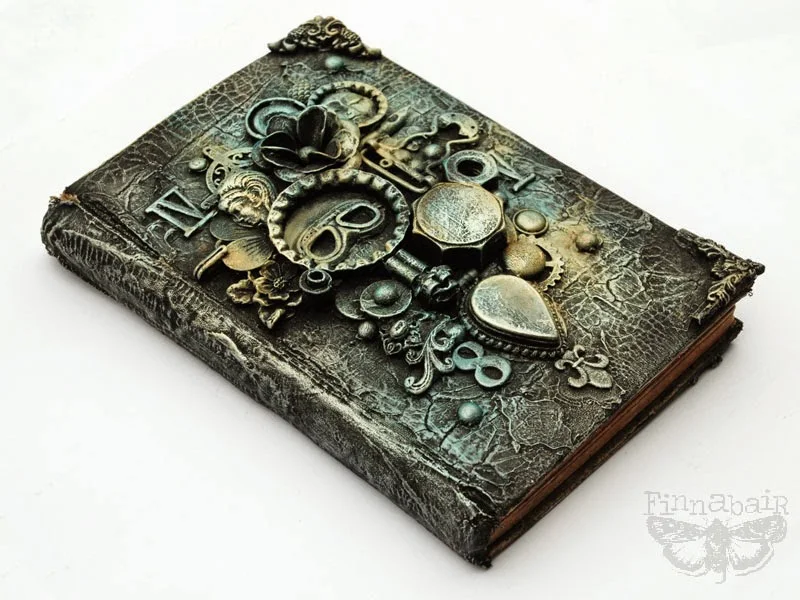
This time I wanted to focus on the background texture too - and what can be better to create worn, leather-like look than Crackle Paste? I applied a lot of my Art Extravagance White Crackle Paste on the book cover and the effect was beyond expectation...

I just adore how this combination of more delicate and more visible crackles made the perfect background for my composition. I'm happy about the weathered, distressed look of the whole book. It was a real flea market finding, of course!


Art Basics Modeling Paste did the trick again: not only filling the imperfections on the cover but also to glue down all the elements on the cover... pretty impressive! I'm so proud how versatile and useful Art Basics are! (insert a smile of proud Mom here ;))
So now - here is the whole story!

1. My first step was pretty simple: I picked nice, vintage hard-covered book and using a palette knife I put a thick coat of Prima Art Extravagance White Crackle Paste on both covers ant the spine. White Crackle is the only matte paste from the range - and it's also my favorite one! It's easy to paint over it with gesso, acrylic paints or inks, it gives nice, matte - and crackled - surface to work on! Another great advantage is this crackle paste is less delicate than others and it can be dried with a hairdryer or carefully and from the distance - with a heating gun. Of course you have to be very delicate with this process - much more than with any of Art Basics products. The thicker the coat of Crackle Paste, the bigger the crackle you get - you can see mine were really visible. So cool!

2. When my covers were dry I started decorating the front using a selection of different items from my "rubbish boxes" and real Prima embellishments (Mechanicals, Junkyard Findings). This is my favorite way of creating - turning rubbish into art... I used Art Basics Modeling Paste to glue down all the elements. I dried the project again to make sure my embellishments won't move when I'll start painting!

3. Next i covered everything - both background and composition with a coat of Art Basics Heavy Black Gesso. It took just a moment to dry - everything turned into beautiful, dramatic black! I wanted to show the beauty of all the crackles and details so I started dry-brushing with a soft flat brush a bit of Metallic Rub - Viva Decor Inka Gold in a beautiful shade of Old Silver. In a moment my project changed completely!

4. After a moment of brushing in the Old Silver Inka Gold I decided to add a bit of other tones into my project: I brushed a bit of Steel Blue and Gold on my front cover. It was easy and fun to do!

And here it is, ready! Of course Inka Gold is just one of the options of getting the look similar to my altered journal cover. You can experiment with metallic acrylic paints, rubs, pastes and even Art Ingredients Mica Powder mixed with Art Basics Soft Gel - the imagination is the limit!
I'd like to wish you a wonderful, creative week. I'll be back on Wednesday with something exciting and creative - you have my word for that! But before - check us out on Monday - there will be my wonderful Creative Team waiting for you with a brand new, inspiring tutorial!
Sending you the warmest possible hugs!

Last week was pretty rough - first Paperworld/Creativeworld Show in Frankfurt sucked out all the energy out of me. After all the excitement, meeting lovely, creative people and having the chance to show my mixed-media products to public I found myself sleeping in all possible places at the most crazy hours. Then we had some major issues with internet connection (which happens from time to time here) and finally family life demanded a bit of my presence... all that together caused I missed my Art Recipe Wednesday post... well, I hope you understand no matter how much I try to pretend I'm not made of steel :)
Talking about steel... I decided not to give up and finish my regular Art Recipe for you - especially this one I'm really happy about! I wanted to come back to some raw industrial or steampunk look I tried couple of time in the past and now missed a bit... Starting new Art Journal was a great chance to create something the way I love the most: digging in my rubbish boxes, putting things together in eclectic, freestyle way to finally get full texture and monochromatic colour palette. Oh, I missed t so much.. and I want more now!

I love the colors and composition here - it reminds me the cold tones I always admired in H. R. Giger's artwork and brings back the joy of putting random objects together to create something new, unique, with deeper meaning. This book will be my private Art Journal for this year as I decided to follow couple of journaling challenges offered in the net - to keep my creative juices flowing!

As I love combining look of raw, simple materials such as metals, plastic or ceramic together with pretty resin or metal embellishments I very often decide to start with dark colors in my project. They cover all the "color issues" completely. I just love how black makes the depth of the composition just unbeatable comparing to any other.

This time I wanted to focus on the background texture too - and what can be better to create worn, leather-like look than Crackle Paste? I applied a lot of my Art Extravagance White Crackle Paste on the book cover and the effect was beyond expectation...

I just adore how this combination of more delicate and more visible crackles made the perfect background for my composition. I'm happy about the weathered, distressed look of the whole book. It was a real flea market finding, of course!


Art Basics Modeling Paste did the trick again: not only filling the imperfections on the cover but also to glue down all the elements on the cover... pretty impressive! I'm so proud how versatile and useful Art Basics are! (insert a smile of proud Mom here ;))
So now - here is the whole story!
Here is my Art Recipe for this week - surprisingly very simple!

And below you can find a short step-by-step explanation how this cover was made - enjoy!
1. My first step was pretty simple: I picked nice, vintage hard-covered book and using a palette knife I put a thick coat of Prima Art Extravagance White Crackle Paste on both covers ant the spine. White Crackle is the only matte paste from the range - and it's also my favorite one! It's easy to paint over it with gesso, acrylic paints or inks, it gives nice, matte - and crackled - surface to work on! Another great advantage is this crackle paste is less delicate than others and it can be dried with a hairdryer or carefully and from the distance - with a heating gun. Of course you have to be very delicate with this process - much more than with any of Art Basics products. The thicker the coat of Crackle Paste, the bigger the crackle you get - you can see mine were really visible. So cool!
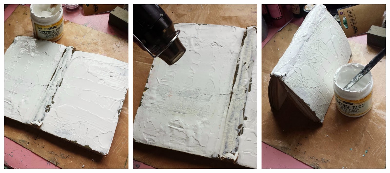
2. When my covers were dry I started decorating the front using a selection of different items from my "rubbish boxes" and real Prima embellishments (Mechanicals, Junkyard Findings). This is my favorite way of creating - turning rubbish into art... I used Art Basics Modeling Paste to glue down all the elements. I dried the project again to make sure my embellishments won't move when I'll start painting!

3. Next i covered everything - both background and composition with a coat of Art Basics Heavy Black Gesso. It took just a moment to dry - everything turned into beautiful, dramatic black! I wanted to show the beauty of all the crackles and details so I started dry-brushing with a soft flat brush a bit of Metallic Rub - Viva Decor Inka Gold in a beautiful shade of Old Silver. In a moment my project changed completely!

4. After a moment of brushing in the Old Silver Inka Gold I decided to add a bit of other tones into my project: I brushed a bit of Steel Blue and Gold on my front cover. It was easy and fun to do!

And here it is, ready! Of course Inka Gold is just one of the options of getting the look similar to my altered journal cover. You can experiment with metallic acrylic paints, rubs, pastes and even Art Ingredients Mica Powder mixed with Art Basics Soft Gel - the imagination is the limit!
Here is a list of supplies from our Mixed Media Place Store to help you a bit with choices:
 |  |  |  |  |  |
 |  |  |  |  |  |
 |  |
I'd like to wish you a wonderful, creative week. I'll be back on Wednesday with something exciting and creative - you have my word for that! But before - check us out on Monday - there will be my wonderful Creative Team waiting for you with a brand new, inspiring tutorial!
Sending you the warmest possible hugs!


37 comments:
Finn, this is simply amazing. I love that you've chosen black for this unique piece. The composition you've created and the crackle paste effect are amazing as well. Hugs
Just stunning like all of your work. I especially love the monochromatic look with the hints of color from the Inka Gold.
Amazing project!!! So glad you had some family time, thanks for taking the time to share your recipes with us, looking forward to Wednesday!
This is spectacular - I love the crackle you were able to achieve on this. The black really does add depth. I hope you get some time for yourself soon.
votre imagination est parfaite ! magnifique création <3
You KNOW I love it! Industrial, yay!
this is amazing.
What a wow project! Great, lovely, inspirational as usual. Love it. Thanks for sharing.
I love this Finn, you have excelled yourself. I am certainly feeling inspired.
Amazing ART creation!!!Congrats and thank you for sharing with all of us!!!
Piękna i inspirująca praca. :)
No i to się nazywa ręka mistrza! muszę kiedyś spróbować :)
This is how I think of your art. Dimensional, dark but ohh so pretty.
Gorgeous! Love your steampunk vintage style!!
Finn,
This is so pretty and industrial all at the same time. I'm starting a box of findings and looking at things differently than before. I can't wait til I start my next canvas.
What an amazing project. I really love the effect you have achieved. I hope you get a chance to recharge your batteries. Your schedule always seems pretty relentless! Elaine
Beautiful - I am always amazed how you take a bunch of stuff that "does not go together" and make them into a beautiful master piece!!! Awesome!!!
Love your journal cover. The crackle paste makes it look
so vintage and is a wonderful
effect.
Thank you for the tutorial.
Incredible, beautiful, stunning, I,am running out of words to say this is amazing. Sue Balawajder
Simple and beautiful! Love it! :)
Beautiful! Good to hear you got caught up on your rest and I'm sure family was happy to see you.
Fabulous ! Really inspiring tutorial thankyou x
Piękna...
ah, I love it! =) It makes me happy to look at this. I hope you get a chance to rest up now after a whirlwind time!
my goddnes, I love your work, but when you sharing your process is stunning!, thank you so much! you're amazing
Beautiful as always. Your work still inspires me so much. Thanks for a great tutorial. Off to play now lol
Marzenie! Świetna praca!
ojej... to jak Finn będzie robić wpisy w TAKIM żurnalu, razem z Kawą i Nożyczkami, to naprawdę robi się zacne grono. i zacnie się poprzeczka podnosi. okładka śliczna (jak zwykle u Ciebie...), środek też pewnie będzie mi zapierał dech
Oh yes of cours you can be proud!!!! It's georgous! I love it. I will try it. Thanks for the tutoriel
wow!!!!!!! it is great!!! as all your works, Anna! ;))))xxxx
awesome!
Love the subtle but dramatic colour in the piece, fabulous work! Thanks so much for the inspiration and the fab tutorial!
Beautiful project!!! Thanks for sharing!!! xoxo
Oddech utkwił gdzieś między serduchem a żołądkiem... przynajmniej tam go poczułam... Piękna okładka, cudowne zestawienie dodatków i kolorów. Moje wyrazy podziwu nie oddadzą uroku Twojej pracy!
Wow! Wow! Wow!!!!
Spectacular!!! Thank You so much for the tutorial!!!
I will do!
Xxx
Spectacular! Beautiful, cool and functional. Another amazing project!!
Wow!!!!!
Niesamowity początek:)
Post a Comment