Hi my dear friends! I hope you are having a great creative week!
I've been working on several projects in one time in the last day - both artistic and private - and I was also able to discuss a couple of important matters with my friends and loved ones. One of the topics that kept coming back to me in the last weeks was supporting those of you who are just beginners, or rather shy personalities who are willing to make first steps into world of mixed-media. After brain-storming with my lovely Creative Team we've came with exciting and interesting solution - and I hope it will be the right answer to your needs. All I can say for now is - watch this space later this month!
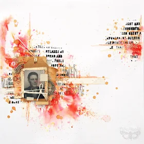
In the meantime my own head was spinning and I felt I have to try to challenge myself to work the way which is not easy for me at all - focusing on simplicity. When I mean "simplicity" I don't think only about simple design and clean background, narrow range of techniques - I also wanted to make something on low budget! Going back in time to the first years of my creative adventure when all the supplies were very limited and it was crucial to find a way to replace some of not s easy to get embellishments or papers... So I decided to trust my instinct and started digging in piles of papers and junk you can see on my desk. It didn't take me long - and here is the result:
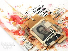
This page was built around he photo of my grandfather, Józef, which I had on my desk for some reason. It got splashed and stained by accident with red spray, but instead of throwing it away I wanted to use it in a creative way! Next important elements were 2 pieces of old Polish note, which - what a surprise - were also in red colour... next steps were just a matter of moments: some fabric tape from local pharmacy, pieces of kraft and vintage paper, a bit of twine, some old pins - great beginning of a simple, but striking composition.
Only "real" embellishments I've decided to use were 2 pieces of Mechanicals and some silver Micro Beads, matching the colour of the silver metal. All the other elements are found objects, art mediums, paints or pencils - how cools is this?
Background textured text was one of the first steps I've made on this page - and I have to say I love this two-tone effect and I will have to repeat this idea in the future. I'm also very happy with the watercolour effects I got using Primary Elements, Prima Watercolour Pencils and Tea Stain - just perfect combo for this page! I'm really happy with the final look of this project - no matter it's hard to name it a "scrapbook page", not an "over sized journal spread"... looks like you can't fight with your nature for too long!
1. I've started with making a very simple composition under my chosen photo - I've just used a single kraft paper tag, some fabric tape, some white twine and old pins and a piece of old Polish note I found in my stash. Next I've taken stencil with cool looking text and I've applied my Art Basics Modeling Paste and Heavy Black Gesso in the selected areas of the page. Art Basics Heavy Gesso (Black and White) are formulated to work nicely with stencils, so you can create a range of great effects using just these products! Applying Modeling Paste and Black Heavy Gesso is a fun way of making unique looking, really eye-catching two-toned texture, black and white "embossed" effect. For best results I suggest to start with Modeling Paste and finish with Black Gesso.
2. I dried my texture with heating gun and started to layer elements I found on my desk: a piece of craft paper, piece of old page from the book, another half of the note, some more fabric tapes and finally - some metal elements. (I've used 3D Foam Tape for these elements - from scrapbook adhesives by 3L).
3. When I was happy with my composition I was ready to add colour. I've decided to keep my colour palette very simple, corresponding with colours of the Polish note and little splashes of paint I already had on my photo. I've picked Poppy Red from Primary Elements Pigments range and I've sprinkled just a tiny bit in the selected parts of my page. Next I've sprayed it with water - and the magic happened! Igot wonderful, inspiring bursts of colour: shades of pink, red, yellow and orange (yes, they were all mixed to create this Primary element Powder!)
4. I've dried my project again and I've added some touches to the composition using Prima Watercolour Pencils in orange, yellow and pale yellow - just to add some free-hand lines and doodles. I didn't blend it with other colours - i wanted to see all the details of the pencils. Next, to add some lovely brown tones on my page I splashed some homemade tea stain - very strong black tea infuse. The effect was just great - tea colour matched perfectly! When the page was dry I added the text - using soft graphite pencil
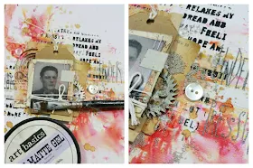
5. Using some more of 3D Foams I've placed my tag with photo in the selected point of my composition and I've started adding my finishing touch - adding a bit of Art Ingredients Silver Micro Beads. I've used a bit of Art Basics Soft Matte Gel as my adhesive - I've applied it n the places I wanted to see my micro beads and after a short moment I've sprinkled the Micro Beads on my project. I left it for couple of minutes to dry and when I was sure the glue started to work I removed the loose beads.
In a couple of minutes Soft Gel was dry and my project was ready. simple, fast - and oh, so fun!
This is all for today, but I hope you've enjoyed this project and tutorial! I need to moce to packing and getting ready fore classes this weekend - Barcelona, here I come!
Sending warmest hugs
I've been working on several projects in one time in the last day - both artistic and private - and I was also able to discuss a couple of important matters with my friends and loved ones. One of the topics that kept coming back to me in the last weeks was supporting those of you who are just beginners, or rather shy personalities who are willing to make first steps into world of mixed-media. After brain-storming with my lovely Creative Team we've came with exciting and interesting solution - and I hope it will be the right answer to your needs. All I can say for now is - watch this space later this month!
In the meantime my own head was spinning and I felt I have to try to challenge myself to work the way which is not easy for me at all - focusing on simplicity. When I mean "simplicity" I don't think only about simple design and clean background, narrow range of techniques - I also wanted to make something on low budget! Going back in time to the first years of my creative adventure when all the supplies were very limited and it was crucial to find a way to replace some of not s easy to get embellishments or papers... So I decided to trust my instinct and started digging in piles of papers and junk you can see on my desk. It didn't take me long - and here is the result:
This page was built around he photo of my grandfather, Józef, which I had on my desk for some reason. It got splashed and stained by accident with red spray, but instead of throwing it away I wanted to use it in a creative way! Next important elements were 2 pieces of old Polish note, which - what a surprise - were also in red colour... next steps were just a matter of moments: some fabric tape from local pharmacy, pieces of kraft and vintage paper, a bit of twine, some old pins - great beginning of a simple, but striking composition.
Only "real" embellishments I've decided to use were 2 pieces of Mechanicals and some silver Micro Beads, matching the colour of the silver metal. All the other elements are found objects, art mediums, paints or pencils - how cools is this?
Background textured text was one of the first steps I've made on this page - and I have to say I love this two-tone effect and I will have to repeat this idea in the future. I'm also very happy with the watercolour effects I got using Primary Elements, Prima Watercolour Pencils and Tea Stain - just perfect combo for this page! I'm really happy with the final look of this project - no matter it's hard to name it a "scrapbook page", not an "over sized journal spread"... looks like you can't fight with your nature for too long!
Here is the art recipe and tutorial - enjoy!
And here is the page - explained step-by-step for you:
1. I've started with making a very simple composition under my chosen photo - I've just used a single kraft paper tag, some fabric tape, some white twine and old pins and a piece of old Polish note I found in my stash. Next I've taken stencil with cool looking text and I've applied my Art Basics Modeling Paste and Heavy Black Gesso in the selected areas of the page. Art Basics Heavy Gesso (Black and White) are formulated to work nicely with stencils, so you can create a range of great effects using just these products! Applying Modeling Paste and Black Heavy Gesso is a fun way of making unique looking, really eye-catching two-toned texture, black and white "embossed" effect. For best results I suggest to start with Modeling Paste and finish with Black Gesso.
2. I dried my texture with heating gun and started to layer elements I found on my desk: a piece of craft paper, piece of old page from the book, another half of the note, some more fabric tapes and finally - some metal elements. (I've used 3D Foam Tape for these elements - from scrapbook adhesives by 3L).
3. When I was happy with my composition I was ready to add colour. I've decided to keep my colour palette very simple, corresponding with colours of the Polish note and little splashes of paint I already had on my photo. I've picked Poppy Red from Primary Elements Pigments range and I've sprinkled just a tiny bit in the selected parts of my page. Next I've sprayed it with water - and the magic happened! Igot wonderful, inspiring bursts of colour: shades of pink, red, yellow and orange (yes, they were all mixed to create this Primary element Powder!)
4. I've dried my project again and I've added some touches to the composition using Prima Watercolour Pencils in orange, yellow and pale yellow - just to add some free-hand lines and doodles. I didn't blend it with other colours - i wanted to see all the details of the pencils. Next, to add some lovely brown tones on my page I splashed some homemade tea stain - very strong black tea infuse. The effect was just great - tea colour matched perfectly! When the page was dry I added the text - using soft graphite pencil
5. Using some more of 3D Foams I've placed my tag with photo in the selected point of my composition and I've started adding my finishing touch - adding a bit of Art Ingredients Silver Micro Beads. I've used a bit of Art Basics Soft Matte Gel as my adhesive - I've applied it n the places I wanted to see my micro beads and after a short moment I've sprinkled the Micro Beads on my project. I left it for couple of minutes to dry and when I was sure the glue started to work I removed the loose beads.
In a couple of minutes Soft Gel was dry and my project was ready. simple, fast - and oh, so fun!
And here are all the products - linked to our Mixed Media Place Shop:
This is all for today, but I hope you've enjoyed this project and tutorial! I need to moce to packing and getting ready fore classes this weekend - Barcelona, here I come!
Sending warmest hugs


Thanks so much for sharing this,it really is so useful to see something "simple" for us newbies who are dipping our toes into the mixed media world. I have photo of my son and his dog I took last week and this has really stimulated my ideas of how to use it in a canvas. Your work is always just stunning....wonderful xx
ReplyDeleteYour work is stunning !
ReplyDeletecorinne
Thanks Finn for thinking of us newbies! For what I want to do though, I can easily do without fancy paper, expensive paints, inks and sprays, and I love using found objects... its the media that are killing my budget. Gesso, gel medium, modeling paste and others are SO expensive (at least here in Canada). My one indulgence was using a coupon and buying Mod Podge to use instead of gel medium because I can't afford gel medium! I'm going to need to use the Mod Podge (or maybe white school glue?) to make my own gesso and modeling paste or maybe paper clay. Being creative is expensive!
ReplyDeleteAnother wonderful layout and tutorial! Going to have to give that modeling paste and black gesso technique a try. Love the results! Thanks for the inspiration.
ReplyDeleteLove your work <3
ReplyDeleteFantastic and what a wonderful way to utilise your inky photo xx GailT xx
ReplyDeleteGreat page! I think it is a great idea to keep things simple for a change and to show that it is possible to make beautiful things this way. xx Ilana.
ReplyDeleteVery clever the moldeling past and black gesso, gon a try it for sure!
ReplyDeleteVery beautiful & inspiring!
ReplyDeleteAlison x
love love love again Finnabair wow Stunning project.
ReplyDelete