Strony

Saturday, 28 February 2015

Welcome New Art Friends!

Hello, my Friends!
I have a very special post for you today! :)
I have the pleasure to introduce two very special Ladies who will be joining my Creative Team in March!
Please, give them a loud cheer and a very warm welcome and get ready to be seeing some breathtaking Art coming soon...

First, I'd like you to meet Gayle - a wonderful lady from Australia with whose art works I have been seriously in love for a very long time...


She has a unique sense of color and every time she shows a new piece, I am blown away with all the deep meanings and messages enchanted in such beautiful forms...

Just to give you an idea and to make you fall in love, too - we'd like to show you two pieces created by Gayle that she says are very true to her and that represent her wonderful style:


Now you know what I mean, don't you? :)
Wanna know more? Here's a short interview:

Gayle Price

1. From: South Australia
2. Always on my work table: pretty much always a mess. Amongst it: gesso, gel medium, sharp scissors, cutting knife, patterned papers and napkins, stencils and stamps
3. Favorite color palette: I love all color as long as it’s rich and deep, but I guess I’m drawn more to cool colors - blues, greens, teal and turquoise
4. Favorite creations: journal pages, tags, (but not cards), layouts, canvases and working on wooden blocks
5. I am inspired by: many things… Other artists like Finnabair (of course), Dina Wakley, Flora Bowley. Nature, song lyrics and passages from books, and magazine pages also inspire me
6. When I see a blank page/canvas: I have to firstly add colour to it and secondly add pattern to it and I’ll work the rest out later
7. Cats or dogs? Cats
8. Tea or coffee? Tea and coffee, depending on time of day
9. Simple or messy? Messy
10. I'm dreaming about: A perfect world

Make sure you follow Gayle's blog and her facebook page. You can also find her on flickr and instagram.

And now - my second new wonderful Creative Team member - Olga.


I have known Olga for a while, her being a Polish girl, our paths had to cross. ;) But I'm so happy she agreed to join the Team and share her unique talent.
Olga's works are so close to my heart as I have a feeling she is a story teller just like me.
And the way she tells her stories is just exquisite!

Just take a look - here's a canvas Olga prepared for us and - of course - there is a story behind it. :)


Olga wrote: "This canvas is titled 'Poison Maiden' and depicts a bit vicious but still irresistable young lady. 
An alchemist’s workshop, a sorcerer’s cave or a chemical laboratory – aren’t these places tempting and full of mystery? For me, they certainly are.
As fate would have it, I don’t spend my days surrounded by stained retorts and dusty volumes but my passion for them still burns inside. So, my weakness for roots of chemistry and pharmacy took form in my very first canvas as a member of the team."


Isn't she just amazing?!
Our Creative Team "tradition" - a short interview:

Olga Siedlecka

1. From: western Poland
2. Always on my work table: in this kingdom of chaos one may find books, cups, toys, stains, gesso, glue, paints and journals
3. Favorite color palette: colors of a sunset sky, spilled on the horizon: cobalt blue, venetian pink, salmon, teal and vermilion as well as burnt vintage with its rusty tones and all fifty shades of grey :)
4. Favorite creations: mixed media canvases, collages, art journaling, upcycling and altered art
5. I'm inspired by: nature, fine art, literature, children's illustration, memories, reflections and found objects
6. When I see a blank page/canvas: I want to tell a story, not necessarily a fairy-tale
7. Cats or dogs? May I choose dinosaurs?
8. Tea or coffee? Both, sweet with milk
9. Simple or messy? Messy, simply
10. I'm dreaming about: a lot of light, no clouds

Olga's blog is THE place to observe! You can also make friends on facebook.

So now I hope you will leave a kind comment and welcome these two exceptional Artists in my Creative Team.
I think that you can't wait - just like me - to see their Art here soon!

Lots of hugs!


Friday, 27 February 2015

Lucky Layout

Hello, Friends!
Another sad goodbye on the blog today. We are parting with our wonderful talented Carole... But we promise each other it's not a farewell but a "see you soon"!
Make sure that you follow her amazing artful creations on her blog! and follow Carole on facebook to be up to date with all the beauty...
I am so grateful that Carole agreed to represent our Team - just take a look at all the breathtaking projects she created for my blog...


This is my last layout for Finnabair Creative team...but not the last one with those amazing products!

I don't have enough words for you, Anna, and for my Creative Team to describe how I feel about our  time together...
First of all, I'd like to thank Anna for this amazing opportunity to be part of your Team and to create with all these products - it was a true dream come true.
I will surely keep in touch with the talented artists from the Team always admiring their talent and their artworks.

And now it's time for my layout and the whole creative process.

First of all, I would like to say that my daughter inspired me so much! This fall she wanted a make up in "Monster High" style or "Dia de los muertos" you know? ...of course I did it! ...and now I decided to scrap it.
I've called this layout "Lucky" because I'm Lucky to have a muse and I'm Lucky to have met those amazing creative ladies from our Creative Team!


I started by creating the flower embellishments.
I took Elementals "Newspaper" Resist Canvas and sprayed it with three colors of Dylusions Inks: Fresh Lime, Vibrant Turquoise and Crushed Grape.
I let them dry but you can use your heating tool of course.


Then, I cut the canvas into strips and sewed like an accordion to join both ends and form a rosette.
To vary the size of the flowers, simply cut the strips of different width.


Here's a close-up so that you can see what a finished flower looks like:


I decided to work on a watercolor paper - it's really resistant when you work with lots of inks and when you plan to glue a lot of embelishment.

I layered strips of papers from Sunrise Sunset collection on two parts of the layout. I cut them into small pieces and then stapled together.
Then, I added a thin coat of White Gesso.


I've used "Brusho" but you can used any ink spray to color your layout. My color combo was: turquoise, fresh lime and purple.
I sprayed some water and got really beautiful stains - another great advantage of working on watercolor paper.
 Then, I took Gelatos in matching colors to highlight the shapes of my papers.


I wanted to add some texture to my piece so I used a Vintage Vanity Checkered stamp and embossed it with white powder.


I also applied Dylusions inks on a piece of paper, then stamped it with butterflies and dragonflies...


... then I cut them out and added to my layout as embelishments:


I covered all the metal embelishments with Gesso and then sprayed with Dylusions inks.


That's all! :)
If you have any questions at all, I am more than happy to help.
Wishing you a very happy and creative day!
Goodbye and see you soon!
Carole

Materials used:


Thursday, 26 February 2015

Art Recipe: Poetry of Decay - journal page

Hi there people!
I'm back with my next Art Recipe - this time art journal pages - in the last days I had a couple of ideas for my journal so why resist?

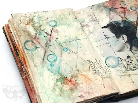
"Poetry of Decay", shown below started as an idea of creating textures which will be both light in colors and pretty heavy in texture giving the impression of fading, disintegration and deconstruction. As always - pages are all emotional, telling stories which are somewhere close to the surface, willing to be told before they will suffocate me. I guess I'm not going to start write poetry or short novels (too late for that - I should have started 15 years ago!) so my art journal and collage are the options which are left!


Subconsciously, I came back to the color combination which I somehow relate with longing, feeling empty or deprived - those of you who were playing with "Cold Country" collection from 7 Dots Studio should find a relation with ease. I was trying to show full palette of opposite feelings, hot and cold ones which can be hidden deep in us and be present in the same time.


I'm very pleased with the effects of experimenting with a mixture of Art Basics Modeling Paste and Art Extravagance White Crackle Paste. I tried to get effect of crushed, peeling walls and I guess I succeeded! I love how the photo blended in the whole composition too - working with texture mediums will always be on my top list.


Honestly - these crackles and modeling paste textures which are similar to old plaster made my heart sing! Color combination wasn't a simple one as I was trying to find the right palette for quite a while. Finally I've used 3 different colored mediums: shimmering sprays from Lindy's Stamp Gang, Art Ingredients Mica Powders and Watercolor Pencils. 

I hope I will find more time to play with this photo - this is a great show which we've made years ago for one of my collage projects... and it is just perfect to play with.  This time I covered it with a coat of Art Basics Clear Gesso - for protection and to paint on the photo with watercolor pencils. I love how it finally turned out.

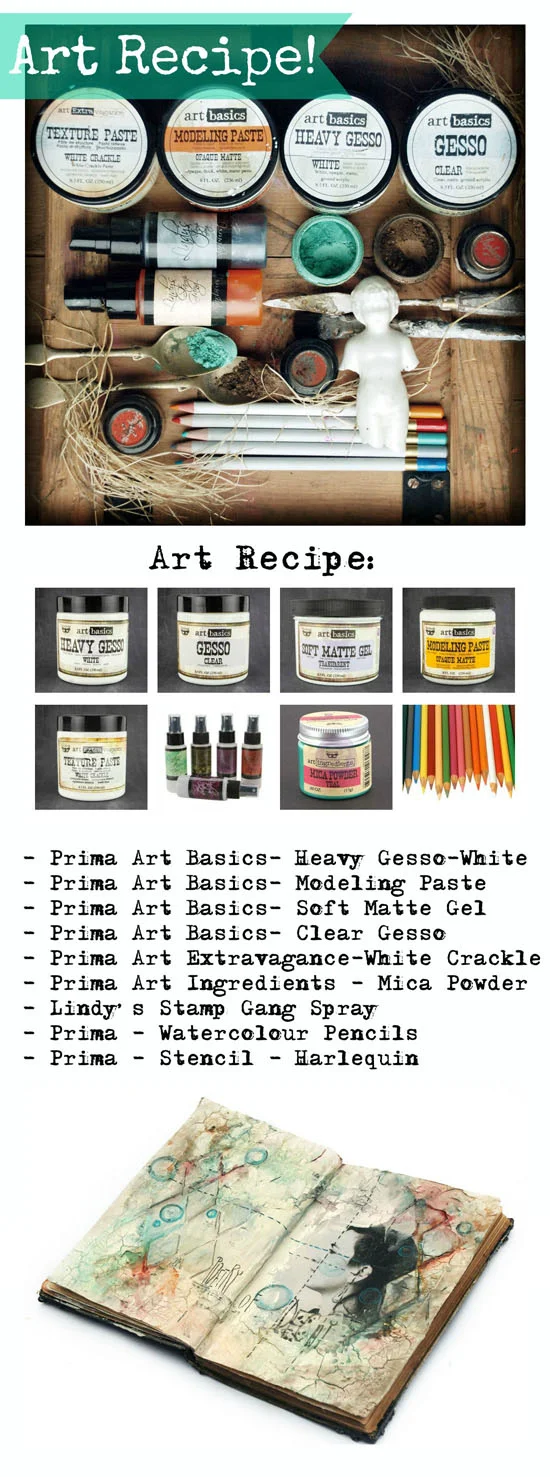
So here it goes - full Art Recipe for you to play with: 


The whole project, explained step-by step is below - have fun experimenting with these techniques!


1. I started with putting 2 coats of Art Basics Heavy White Gesso on the pages of my vintage book. This stopped my sprays from soaking through the paper. Next I glued the chosen image on one of the pages (I used Art Basics Soft Matte Gel) and I coated the photo with a single, smooth coat of Art Basics Clear Gesso - to change it into matte, easy to paint surface. I dried the pages and I was ready to continue.


2. Next i picked up some scraps of paper, some washi tape and paper doily and I glued these in the selected places of my composition to add some nice texture. I used Art Basics Soft Matte Gel again. I dried the composition with the heating tool and moved to the next step: adding dimensional Harlequin pattern. I used Art Basics Modeling Paste which I applied with a palette knife through the stencil. I added a bit of extra of the Modeling paste in the corners of the composition to create more dimensional look of "old plaster".


3.Next I moved to Art Extravagance White Crackle Paste which was applied more in the middle of the page, overlapping the photo and Modeling Paste pattern. I was hoping to create really weathered, vintage look. I left the book in the dry, warm place to speed up the cracking process.


4. When my project was dry again - and nice crackling appeared I was ready to add the color. First I sprayed The pages with Lindy's Sprays - shades of gray, yellow and A touch of pink. after drying I also added a bit of patina look spraying Art Ingredients Mica Powders mixed with Water: Teal and Rust. I dried the project completely.
Last step was adding some touches of color with Watercolour Pencils (I used new Prima - soon available in the shop!) and mixing them a bit using water brush. Finally, using very soft pencil,  I drew lines, bubbles and added text. I colored the bubbles with a touch of light blue and turquoise pencil. Voila! Ready!


I think using watercolor pencils is one of my favorite journaling techniques in the last months - did you try it yet? If not - beware - it's very addictive!


And here you can find all the products listed - available in our Mixed Media Place Shop!


I hope you enjoyed - and got inspired to play a bit!
Sending warmest hugs to you all